
MTS Simple Booking Cの予約フォームのスマホ対応

MTS Simple Booking Cの予約フォームについてスマホ表示のときに枠を広くする方法を紹介します。加工イメージは次のようになります。
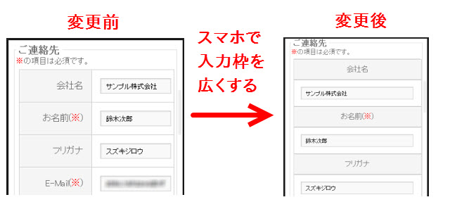
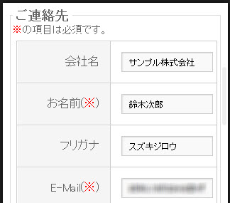
MTS Simple Booking Cの初期設定の予約フォーム
MTS Simple Booking Cでは初期設定の予約フォームもレスポンシブになっていますが、テーブルレイアウトでの表示のため場合によっては各項目が入力しづらいかもしれません。
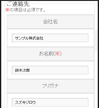
予約フォームの入力枠を広くする
今回のカスタマイズの趣旨は、テーブルレイアウトをバラバラにして、見出しと入力項目を単純に上から下に表示しようというものです。入力枠が広くなるのがメリットです。
使用するCSSは次のとおりです。子テーマのstyle.cssなどに入力してお使いください。おおざっぱにまとめてあるので必要に応じて微調整およびカスタマイズをお願いします。
@media (max-width: 480px) {
    #booking_client-fieldset table th,
    #booking_client-fieldset table td,
    #booking-reservation-fieldset table th,
    #booking-reservation-fieldset table td,
    #booking-message-fieldset table th,
    #booking-message-fieldset table td,
    #booking-confirm-fieldset table th,
    #booking-confirm-fieldset table td {
        display: block;
        float: none;
        width: 90%;
        text-align: center;
        overflow: auto;
    }
}
これで、予約フォームの各項目がバラバラになり上から下に表示されます。テーブルレイアウトよりも枠が広くなり、スマホなどでは入力しやすくなるでしょう。